Amazon AWS
Open distro for Elasticsearch
Anomaly detection redesign
UX/Data Visualization
Role
UX Designer
Team
1 product manager
3 science engineers
1 software development manager
5 software development engineers
Approximately 70% of Amazon Elasticsearch service customers use it for log analytics. The Kibana dashboard provides them with the ability to build visualizations that help them analyze their operational log data. We introduced alerting and anomaly detection as a package to help customers proactively configure alerts and understand outliers on their log data.
Using machine learning to detect anomalies based on parameters set by the customer, the system can label what it considers anomalous and alert the customer on these findings.
Problem
After the initial release of anomaly detection we gathered feedback from customers and open-source community members who were looking for a more complete solution.
Lack of up-front documentation
New customers found it difficult to understand how to get started and sample detectors they could learn from were available, but hidden.
No continuity in the creation flow
Customers would create a detector but still had to configure the model parameters for detection.
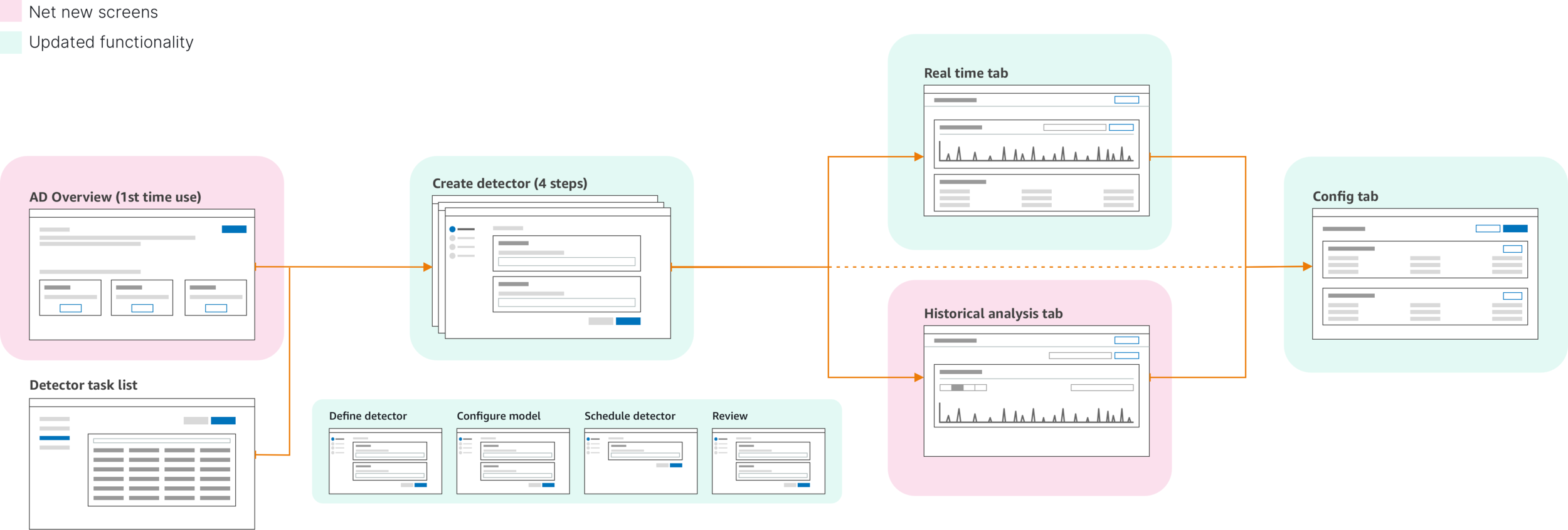
1. Create detector
A single page create flow making customers think no further steps were necessary to produce results.
2. Model configuration
Customers were dropped into a view configuration screen, often missing the detector model configuration.
3. Empty results
Many customers complained about the lack of results but did not realize the model configuration needed to be set.
Real-time focus
The detector provided only real-time results and not much details to help with investigating the anomalies.
Lack of unique values
The detector surfaced general anomalies within the system and was not able tp display specific entities (such as product ID or ISBN number) that had the anomalous behavior within its own time series.
Process
A thorough competitive analysis to help understand similar product use cases, including with internal products and services:
Internal- Cloudwatch metrics, Quicksight
External- Datadog, X-pack, Sumo Logic
Direct customer interviews (Transferwise, John Deere, Mobilewalla) provided insights into needed improvements and helped the team prioritize the roadmap of enhancements. Their feedback insights into what may be missing from the existing customer journey.
Customer journey with additional user stories

Updated create flow
Setting UX/development milestones
With many features were being added to a single launch delivery - I worked with the product and engineering manager to establish a UX delivery schedule based on level of effort. This way the engineering team could put more time to focus on the more complex parts throughout the entire project life-cylce and time-box smaller projects accordingly. This also allowed for scheduling of our content partners to go over the UI copy with enough time to make necessary changes.
A tale of two design systems
Our current designs are based on the principles of the AWS Polaris design system and using components from the open source Elastic UI component design system. As the OpenSearch dashboard product matures, our goal is to bring in a complete in-house and open source system and pattern library. This effort is being led by the entire design team on OpenSearch.

Designs
The final designs below display screens that were delivered for launch of the Elasticsearch service (Now named OpenSearch) dashboard application.
Up front documentation
An overview page was added to give customers the ability to learn about anomaly detection and easily find further documentation as well as sample detectors up front that could be quickly set up for hands-on learning.

An actual overview page with documentation links and sample detectors up front.
Stepped create flow update
The addition of steps in the create flow not only provided clarity in what was needed to get a detector up and running, but also allowed scalability for future additions to thew create flow.
Creation flow broken down into clear steps with a final overview page.
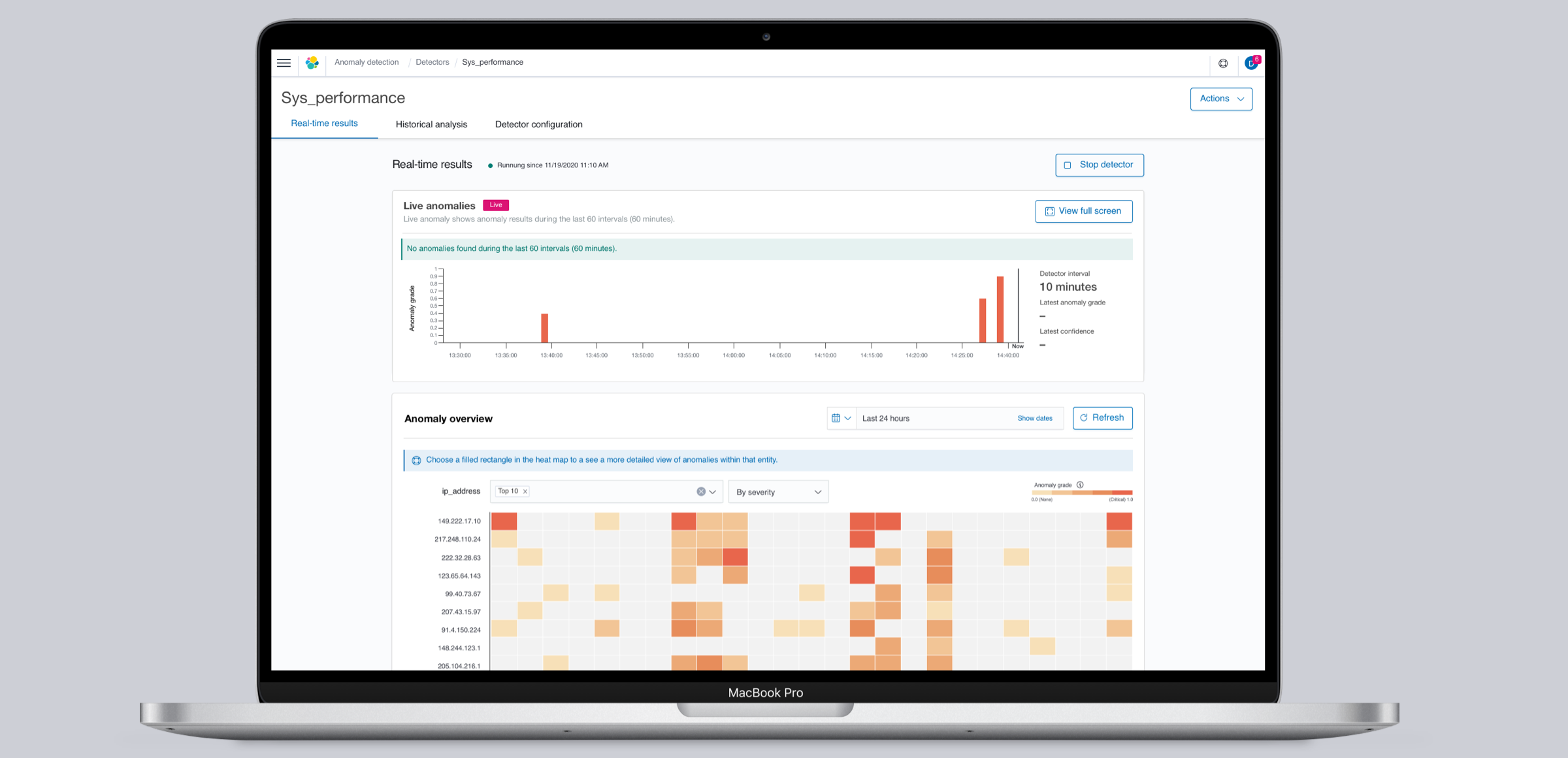
Visualization updates
Customers were now able to select a field to spit the data stream and check for anomalies in specific entities.
Historical analysis
Customers were now able to see anomalies in past data to make better informed decisions. This also helped with enhancing model training for faster initialization and higher confidence scores:
Historical analysis
Customers were now able to see anomalies in past data to make better informed decisions. This also helped with enhancing model training for faster initialization and higher confidence scores.
Feature attribution
Customers could not see information on which feature (field) used for detecting was the highest contributor to an anomaly.
Feature attribution
Each feature provides the percentage contribution within the feature breakdown.
Results (so far…)
The team delivered on two biggest customer requests:
The addition of category fields to give them more ways to split data and get a closer understanding of which entities are displaying the highest score and number of anomalies.
Historical analysis for customers looking into anomalies in past data or compare real-time anomalies to past behavior.
Working with the product and engineering managers, I was able to make sure that along with this feature, we could also deliver on enhancements to make the detection tool easier to set up and provide more information as customers seek for a root cause to their system failures or irregular behavior in their datasets.