
StyleSeat
Pro user signup and onboarding
UX design / Visual design
Role
Design lead
Team
1 design director
1 product manager
6 software development engineers
StyleSeat is one of the leading on demand booking platforms for beauty professionals. As the lead product designer for the Supply side of StyleSeat's marketplace, I was responsible for designing the mobile app's pro experience new product features and enhancements.
Working directly with the head of design and a cross-functional team of engineers and a product manager, we used data analysis and several rounds of user testing to ship fast, and iterate on improvements through direct feedback and data insights.
The problem
StyleSeat was facing pressure to revamp their professional customer experience as the company’s previous strategy was focused on the consumer experience. Customer research and interviews suggested our pro users (beauty professionals) were not clear on what value our product brought to their business. There was also a high rate of ghost accounts, or accounts created but never actually used the product. These ghost users were causing significant issues to our consumer customers looking to connect with professionals in their area.

Key screens of the signup flow with visual design and mental model inconsistencies
A heuristic evaluation of the original signup flow uncovered many inconsistencies and issues within the experience
No clear brand look and feel
Inconsistency in steps of completion
Each screen presented its own UI
Customer pain points
Many key decisions to maker up front
Ambiguous options
No clear next steps after signup
The process
Through direct customer feedback and in app surveys, we learned that our professional customers did not understand the value of the platform. There was also a lot of up front asks that many customers were not ready to provide. A key effort was to do competitive analysis with other products and reviewing signup flows that provided a great onboarding experience. We then developed a clear task flow and customer journey and divided the experience into steps:

Signup- onboard and learn about the value of StyleSeat providing basic info to create an account.
Profile building- build out of customer’s profile and services list on StyleSeat.
Activation of profile- the profile is listed and can book clients through StyleSeat.
Post activation tasks- promote, build an client base.
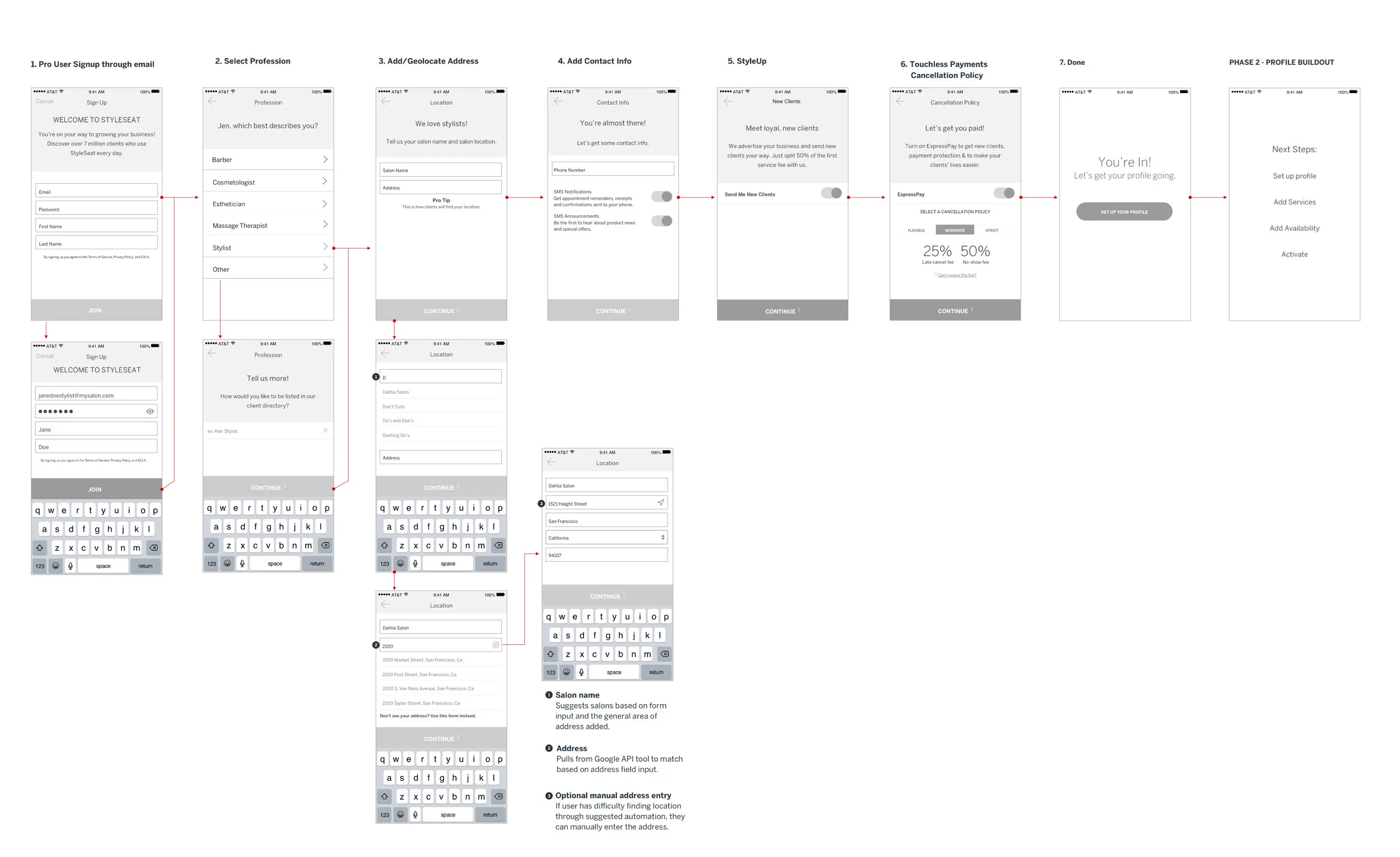
Final wireframes that were used during customer research to validate the initial flow.
Results
The sign-up flow delivered a much improved experience with educated onboarding that drives messaging, felt more unified, simplified the tasks per screen, with a smoother transition of signup to profile/activation.
At every step, the guided experience provides information on the platform or opt-in features, allowing the customer to gain knowledge of the value StyleSeat would add to their business. The entire flow was an educational on-boarding experience with clear completion and next steps once the customer signed up.
33%
Landing to signup conversion
74% improvement
53%
% of signups which complete their profile
(15% improvement)

Signup with improved visual design, consistent look and feel, and detailed completion meter.

Steps to activation let customers understand what had to be done once signed up.
Retrospective
Establishing a design system
As a young company, the design for the pro user experience was put together in a scrappy fashion, several designers using old look and feel elements or their own styles and principles– his feature helped redefine the pro user experience and visual language of the overall product and helped begin to define a pattern library and helped establish a reusable design system.
Introducing native behavior
Built on mobile web technologies using Angular JS, the mobile product lacked the feel of a true native app experience. I worked with the front-end engineering team to make sure the sign-up flow delivered a more native feel, using push and modal transitions that made the flow feel more native-like.
Building trust with the customer
This was the primary touch point for new customers. The updated flow not only gave a unified experience, but also delivered on value proposition to new customers looking for a way to expand their business and client-base. Each screen brought in personification and detailed content to what the customers were signing up for.